Why a Button Needs More Than a Label
Button design is more than button text: learn how shape, placement, and visual emphasis help people recognize what they can click and what will happen.
The common mistake in button design is treating clear wording as the whole job. A button labeled “Save” can still look like a heading, a quiet link, or a disabled control; people may miss it or hesitate because its appearance gives them no reliable cue. Shape, placement, and visual emphasis need to support the label, not compete with it.
That is especially useful to notice when you use a website or app and wonder why an obvious action feels oddly hard to find. A control communicates through several visual signals at once. The label tells you what it does, while its form and position help you recognize it as something you can activate and anticipate its importance.
What makes something look like a button?
A button looks actionable when its visual treatment separates it from nearby text and makes it feel like a distinct control. A filled shape, a clear boundary, or a consistent button style can create that separation. No single treatment works everywhere: a solid rectangle may suit a primary action, while a subtle outlined shape may fit a secondary one.
The important part is consistency within the interface. If filled blue shapes are used for actions, people can learn that visual cue. If the same treatment is used for decorative labels, tags, and inactive items, the cue becomes less dependable. A button should also look different from plain text links, which are usually signaled through color, underlining, or both.
Shape helps define the control’s edges. A generous rounded rectangle can feel like a clear tap target; a thin border around a compact word may be harder to distinguish from surrounding content. The shape does not need decoration. It needs to make the interactive area legible.
Why does the button’s placement matter?
Placement connects an action to the content or decision it affects. A “Download” button beside a file description makes its purpose easier to infer than the same button stranded in an unrelated corner. A “Send” action near a message composer feels connected to the message being sent.
Position also shapes what people understand as the next move. On a form, a primary action often follows the fields and appears near the end of the task. If “Cancel” sits beside it, spacing and grouping should make clear which control completes the task and which leaves it. A label cannot explain every relationship that layout can make visible.
Consider the expected reading path, too. An action placed before the information needed to choose it may feel premature. An action placed far away from that information can be overlooked or mistaken for a page-wide command. Keep related controls near their context, but leave enough space that each remains a separate target.
How does visual emphasis show which action matters most?
Visual emphasis helps distinguish the main action from alternatives. Designers often give a primary button a stronger fill or more contrast, then use a quieter outline or text treatment for secondary actions. This hierarchy can help people scan a screen without making every control shout at once.
Emphasis should reflect the task, not merely the designer’s preference. If “Continue” advances a process and “Back” returns to an earlier screen, they should not appear equally dominant unless the choice genuinely calls for equal weight. Overemphasizing several buttons at once flattens the hierarchy; a bright control loses its special signal when every nearby element is equally bright.
Color alone is a fragile way to convey importance. People may have difficulty distinguishing certain colors, view the screen in different conditions, or encounter a theme that changes the palette. Pair color with shape, position, contrast, and clear text. The interface should still make sense when one visual cue is less visible.
What should a button do when it is unavailable?
An unavailable button should look unavailable, but not so faint that people cannot read it. A muted treatment can signal that the action is inactive. The surrounding context should also help explain what is missing, especially if someone can take a step to make the action available.
For example, a form’s “Submit” control might remain inactive until required information is entered. A nearby note such as “Enter an email address to continue” gives the person a useful next move. Making a button look disabled without explaining why can turn a visual cue into a dead end.
Do not rely on color changes alone to distinguish inactive, pressed, focused, and enabled states. A visible border, change in fill, focus ring, or other distinct treatment can help people tell which state they are seeing. The design should preserve readable text and a clear boundary across those states.
How can you tell whether the signals work together?
Look at the control in context, not as an isolated component. Ask whether its wording names the action, its shape marks an interactive area, its placement connects it to the right task, and its emphasis matches its importance. Then check whether nearby links and controls have distinct treatments.
- Read the label: Can someone infer the action without relying on vague wording such as “Go” or “OK”?
- Check the shape: Does the control have a visible boundary or fill that separates it from ordinary text?
- Check the placement: Is it beside the information or decision it affects?
- Compare emphasis: Does the strongest treatment belong to the most important action in that context?
- Inspect nearby controls: Can people distinguish the button from links, tags, and inactive items?
- Review states: Are enabled, inactive, focused, and pressed appearances distinguishable without sacrificing legibility?
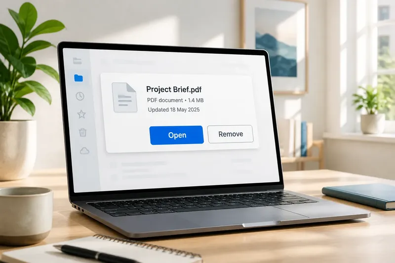
Say you are designing a file card with “Open” and “Remove” actions. Give the card a clear button treatment for “Open,” place both actions beside the file details, and make “Remove” less prominent so it does not compete with the usual next step. The expected observable result is that a person can identify both actions and see which one the interface presents as primary, without mistaking the file name for a control.
It is not worth adding shadows, gradients, icons, or animation simply to make a button look more clickable. Those details can help when they clarify state or hierarchy, but they also add visual noise. Start with a clear boundary, a sensible location, and a well-chosen emphasis.
Why is a button’s label not enough?
A label supplies the action’s words, but not the full visual evidence that the element is interactive or how it relates to the rest of the screen. “Save” might describe an action accurately and still leave its importance, availability, or connection to a particular form unclear. The surrounding design carries those parts of the message.
When button design brings shape, placement, and visual emphasis into agreement with the label, people have more than one way to understand the control. That makes the interface easier to scan and helps a button feel like a deliberate part of the task, rather than a word waiting to be guessed.
For any button you encounter, try hiding the label with your thumb and looking at the remaining shape and position. If those cues still suggest a control and show what it belongs to, the design is doing useful work before the words are even read.