The Quiet Work of Line Length on a Screen
Line length on a screen shapes reading rhythm and comfort. Learn how to choose a text measure for articles, phones, dashboards, and narrow panels.
The common mistake with line length on a screen is letting a text column stretch until it fills the available space. The cost is a reader who has to travel a long way from the end of one line back to the beginning of the next, losing the sentence’s thread along the way. A very narrow column can be tiring too, sending the eye back to the left edge before a thought has had room to unfold.
Line length, often called measure, is the width of a text line. It affects the pace and shape of reading, but there is no single width that suits every screen or passage. The useful choice depends on what the reader is doing, how the text is written, and how much room the interface gives it.
Choose the measure that suits the reading situation
Think first about the reader’s task, not the blank space around the text. Someone following a long argument needs a steady line they can scan without straining. Someone checking a short label needs to recognize it at a glance. Those situations call for different measures.
- Long-form article: Give the prose a bounded column rather than letting it spread across a wide monitor. The reader can follow each line with less horizontal travel, while the paragraph still has enough room to develop.
- Short mobile passage: Let the column use most of the available screen width, with breathing room at the sides. A phone has little horizontal space to begin with; adding generous margins can turn ordinary prose into a stack of very short lines.
- Dashboard or reference panel: Keep explanatory copy within its own readable region. If the panel is narrow, consider whether the copy can be shortened or moved to a fuller view instead of forcing the same paragraph into every layout.
- Large display or kiosk: Keep the reading column visually contained, even when the screen is broad. People should not need to sweep their eyes across an oversized line just because the hardware allows it.
- Poetry, captions, or compact labels: Preserve the intended grouping and meaning. A line break in verse may be part of the work; a label may need to stay beside its control. The right decision is not always to make every line resemble body copy.
These are starting points, not rigid rules. A column that feels comfortable for one typeface and passage may feel cramped with another. Check the actual text at the size and layout readers will see.
See how one passage changes with measure
Imagine a designer placing this invented passage in an article: “A paper map is easy to fold, but its creases can hide a street name. Turning it sideways may reveal the route without changing the destination.” In a very wide column, the sentence can run on in a long sweep. The eye has farther to return, and the two ideas may seem to arrive as one uninterrupted block.
In a narrower column, the passage breaks into more lines. That can make the progression easier to follow: first the creases obscure a name, then a change in angle reveals the route. Narrow it too far, however, and small phrases such as “without changing” may be stranded at the start or end of a line. The reading rhythm becomes choppy, and the paragraph grows taller.
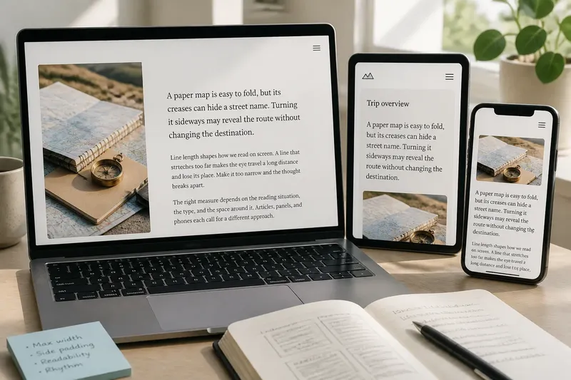
Now imagine that the same passage appears in a phone article, a side panel, and a full-width reading view. The phone may need a modest side margin so the text does not touch the screen edge. The side panel may need a shorter version because its narrow measure makes the prose feel cramped. The reading view can give the full passage a bounded column. One sentence, three contexts, three sensible treatments.
This is why line length cannot be judged by the width of a box alone. Typeface, font size, word length, punctuation, and paragraph structure all affect where the eye pauses. A font with broad letterforms takes more room than a compact one at the same nominal size. A passage full of long technical terms wraps differently from one built from short, familiar words.
Adjust the text without losing the reader
When a layout feels off, change one relevant condition at a time and read the passage again. If the line feels like a long runway, constrain the text column. If the lines break after only a few words, check whether the container is needlessly narrow or its side padding is too large. Avoid shrinking the type simply to fit more words across; smaller text can create a separate legibility problem.
In responsive design, the text measure should adapt as the available space changes. A wide desktop layout can center a bounded reading column, while a phone layout can let the column expand within comfortable side margins. A two-column page may give an article a different container from a sidebar. The important detail is that the measure belongs to the text region, not necessarily to the full screen.
Designers often specify a maximum width in characters or relative units rather than relying on a fixed pixel width. Character-based limits can make the text column respond to type size, while a pixel limit can be easier to coordinate with a precise layout. Neither choice removes the need to inspect the rendered passage: typefaces differ, and browsers wrap actual words rather than idealized average characters.
It is not worth tuning every line break by hand in ordinary prose. Manual breaks can look tidy at one viewport and awkward at another, especially when readers enlarge the text. Let the text wrap naturally, then address the container, font settings, or wording that is causing an unpleasant rhythm.
Check whether the line length is doing its job
A quick review can reveal more than a ruler. Read a real paragraph at the intended text size, then inspect it on a narrow and a wide viewport. Look for a column that feels laborious to scan, a paragraph that becomes a tower of tiny lines, or a layout where one short panel makes the surrounding page feel oddly empty.
- Follow a sentence across the line: Notice whether your eye can return to the next line without searching for its start.
- Check paragraph shape: Watch for repeated one- or two-word endings that make ordinary prose look ragged.
- Compare nearby text: Make sure a sidebar, caption, or card has not inherited a body-copy width that does not suit its job.
- Try larger text: Confirm that the layout remains usable when type is enlarged or the browser is zoomed.
- Read the actual copy: A placeholder paragraph may wrap neatly while the real passage, with its longer words and punctuation, does not.
For web text, CSS properties such as max-width, padding, and responsive layout rules can shape the available measure. The font family and font size matter just as much. If you are working within a design system, check its typography tokens before introducing a one-off width; consistency can be helpful, but the passage still needs to read well in its own container.
Which line length fits your screen?
Should a text column fill the whole screen?
Usually not for long-form reading on a broad display. A bounded column keeps the return sweep manageable and gives the page a clear reading area. On a phone, using most of the available width can make sense, provided the text is not pressed against the screen edges.
What should I change if a paragraph feels cramped?
Check the container width and side padding before changing the type size. If the text lives in a genuinely narrow panel, shortening it or offering a fuller reading view may work better than squeezing every word into that space.
Does font choice change line length?
Yes. Letterforms vary in width, so the same nominal font size and container can produce different line breaks in different typefaces. Review the actual font and copy together rather than assuming a width that suited one face will suit another.
How can I compare two measures fairly?
Use the same passage, typeface, and text size in both layouts, then read each version at the size it is meant to appear. Notice the effort of returning to the next line and the shape of the paragraph, not just how many lines it occupies.
Let the passage set the final boundary
The best line length on a screen is the one that lets this particular text move at a comfortable pace in its intended setting. A long article, a compact panel, and a phone caption may need different boundaries even when they share a font. For a final check, read the real passage at its intended size: the line length should support the sentence, not make the reader work around the layout.