A First-Draft Screen for a Busy Waiting Room
A first-draft waiting-room screen can make updates easier to scan: choose one main message, set a clear reading order, and remove details that compete.
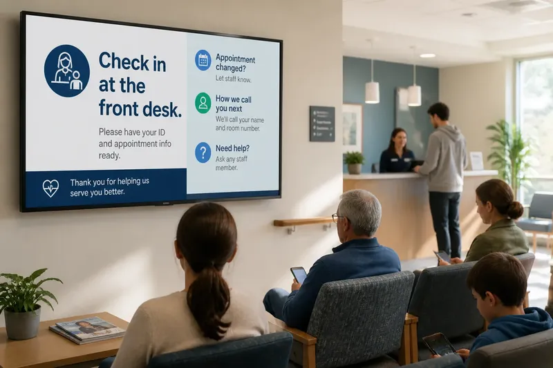
The most common mistake on a waiting-room screen is trying to show every useful fact at once. The cost is a wall of text that people glance at, fail to sort, and abandon while they wait. A first-draft waiting-room screen works better when it answers one immediate question first, then makes the next useful detail easy to find.
Start with the conditions around the display, not a decorative template. People may be seated far away, standing near a desk, watching for their name, or splitting attention between a child and a phone. Your draft has to survive those interruptions. Treat it as an information surface, not a poster with a little motion added.
When the screen feels crowded, choose one primary message
A crowded draft usually reflects a crowded assignment. Someone has asked for directions, estimated waits, service announcements, staff reminders, and a welcome message to share the same screen. Each item may be useful, but equal prominence makes the viewer do the sorting.
Write down the questions a waiting person is most likely to have at that location. In a clinic, these might include where to check in, what to do if an appointment has changed, and how staff will call the next person. In a public service office, the urgent question may instead concern which queue to join. The setting decides the priority; a familiar-looking design does not.
Choose the question that matters most during an ordinary visit and make its answer the primary message. Keep supporting content only if it helps someone act, understand a delay, or get assistance. A cheerful slogan can remain in the room’s decor; it does not need to occupy the screen’s most visible area.
Say you are sketching a screen for a neighborhood health center. The working draft gives equal space to a welcome, a list of services, a reminder to silence phones, and instructions for appointment check-in. You decide that check-in is the immediate task, place “Check in at the front desk” first, and move the other details into a smaller supporting area. A person who glances up can now spot what to do before sorting through the rest.
When readers miss the instruction, fix the reading order
A screen can contain the right message and still fail if the order is unclear. Readers may begin at the largest object, follow a bright color, or scan from the upper left, but competing treatments can send them in different directions. A rough sketch is useful because it exposes that conflict before you spend time polishing icons or selecting typefaces.
Make a small thumbnail on paper or in a plain slide. Use rectangles and short lines, not finished copy. Mark the primary message as the dominant area, place the next supporting detail nearby, and keep secondary information visually quieter. If the screen has several zones, give each one a clear purpose rather than making a mosaic of equal-sized cards.
Then cover the copy or squint at the sketch. The most important area should still be obvious from its position, size, and surrounding space. If a logo, colored banner, animation, or decorative image wins your attention instead, reduce its visual weight or move it away from the main message.
Build the order around the reader’s likely path:
- First: the action or update that affects what someone should do now.
- Next: the short explanation needed to understand that action.
- Then: a secondary detail, such as where to ask for help.
- Last: optional reminders or general information that do not change the immediate task.
This is a hierarchy, not a demand to cram four blocks onto every screen. If there is only one relevant message, let it have room. If a secondary item is essential, make its relationship to the main message apparent through placement and grouping.
When the wording takes too long to scan, edit the message
Long copy often appears because the screen is being asked to explain a policy, anticipate every exception, and sound welcoming at the same time. That is more work than a glance-based display can comfortably handle. Draft the message in plain language, then remove clauses that do not change the reader’s next action.
Prefer a direct instruction over a padded announcement. “Please check in at the front desk” tells a visitor what to do. “We kindly ask all visitors to proceed to the reception area upon arrival” makes the same request with extra reading. Keep a brief reason when it prevents confusion, such as explaining that an appointment change should be reported to staff.
Do not rely on a rotating sequence to rescue an overfull draft. A person may look up between slides and miss the context that appeared earlier. If several messages need to remain visible, separate them clearly and make each understandable on its own. Reserve motion for a genuine need to signal change, not as a substitute for prioritizing.
Names, dates, room labels, and other operational details deserve special care. Use the terms people see on signs and hear from staff. A screen that calls a place “Registration” while the room sign says “Check-in” creates a needless translation task.
When viewers cannot read from their seats, check distance and contrast
A layout that looks tidy on a laptop may collapse across a room. Thin lettering, pale text on a light background, and narrow spacing can disappear at a distance or under glare. Review the sketch at the display’s intended size and from a realistic viewing position; zooming in on a desktop is not a substitute.
Use a restrained palette with clear contrast between text and its background. Avoid putting essential words over a photograph, where changing colors and visual detail can make parts of a line hard to distinguish. Give headings and instructions enough size and weight to remain distinct without turning every item into a headline.
Keep line lengths manageable and allow space between separate messages. Tight blocks are harder to scan, especially for people who are standing off to one side or looking up only briefly. Do not use color as the only sign that something is urgent or belongs to a particular group; pair it with a heading or clear wording.
Accessibility is part of the first draft, not a finishing flourish. Consider readers with low vision, people who do not read the room’s dominant language, and anyone who has difficulty processing dense text. A plain phrase and a visible location cue can help more than a clever symbol whose meaning depends on local familiarity.
When the screen contradicts the room, verify the information flow
Even a legible screen can unsettle people if it disagrees with the staff member at the desk or a printed sign on the wall. This usually happens when no one owns the update, when a message has been copied from an old notice, or when wording is written without checking how the room actually operates.
Before refining the visual design, identify who supplies each changing detail and who can approve the wording. For a draft, mark variable content plainly, such as “[current check-in location],” instead of inventing a real instruction. That makes missing information visible without letting a placeholder masquerade as a finished announcement.
Ask the people who manage the waiting area to review whether the proposed sequence matches the visitor’s real path. They can flag a door name that visitors do not recognize, a desk that is not staffed all day, or an instruction that belongs on a sign nearer the entrance. The designer’s job is to make the information clear, not to guess how the service is run.
For details governed by an organization’s policy, device instructions, or local requirements, check the applicable source once before publication. Keep that check focused: the screen should not become a legal notice or safety procedure merely because those topics are important. Refer readers to staff or the appropriate official source when the full explanation does not fit.
What should you check before showing the draft?
Can someone name the main message after a brief glance?
Show the sketch without explaining it and ask a reader what seems most important. If they mention the logo or a secondary reminder first, adjust the size, placement, or visual emphasis of the primary content.
Can a seated visitor read the essential words?
Review the screen at its intended display size from a plausible seat, including an off-center view. If the instruction is difficult to read, simplify the wording, strengthen the text contrast, or give it more space.
Does each block answer a distinct question?
Label each area in the draft with the question it answers, such as “Where do I check in?” or “Who can help?” If two blocks do the same job, combine them or remove the less useful one.
Can staff tell what must be updated?
Mark changing details and confirm who supplies them before the screen is treated as ready. If an update has no clear owner, keep it out of the final draft until the organization assigns one.
What is not worth polishing in the first draft
Do not spend an afternoon choosing a subtle shadow, a custom illustration, or a perfect shade of accent color while the reading order remains uncertain. Those choices are easy to revise later and do little to fix a confusing message. A pencil sketch, a plain typeface, and a few blocks are enough to test the screen’s basic logic.
Likewise, avoid adding an icon to every line just to make the layout feel designed. Familiar symbols can help, but unfamiliar ones add interpretation work. Use a short label when it is clearer, and keep decorative assets out of the way of the instruction.
The useful first-draft waiting-room screen is not the one with the most content or the most polished surface. It is the one whose primary message can be spotted, understood, and acted on without asking a visitor to solve the layout first. When the screen changes, review that order again: a new announcement can quietly become the most important thing in the room, whether the design intended it or not.